YourMechanic
Mobile app new feature design
Role
Lead UIUX Designer
Collaboration
Product Manager, Head of Product, Engineer Team
Duration
6 weeks/phase
Tool
Sketch, Figma, After Effects, Hand Drawing


Get vehicles repair and maintenance services at your home or office

Mechanics on demands version Uber
Mechanics manage appointments to provide vehicles repair and maintenance services
OUTCOME.
Increased company revenue via defined metrics on the redesigns
-
Increased by 20% company revenue in 10 months
-
Reduced by 8% in reservation cancellation rate in 4 months
-
Kept 96% service completion rate for 4 months

3000 Mechanics
20 States in US
2.5 Million Users
DESIGN PROCESS.

Case Study
User Interview
User Persona, Journey
Pain Points, Demands
Use Case
Work Flow
Definition
Challenge
Assumption
Clarification
Iteration
Solution
Design
White Boarding
Lo-Hi Fi Wire-framing
Prototyping
Usability Testing
Iteration
Mockup
Design
Presentation
Spec
Hand Off
Follow Up
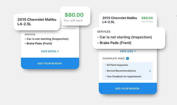
BEFORE & AFTER.
Open Past Due feature redesign

PROBLEM.
8-15%
appointments were not processed in time, and most of them are finally cancelled by end users
Lost chances that can be turned into revenue
GOAL.
-
Help appointments move smoothly
-
Reduce reservation cancellation rate
-
Increase revenue
Enter a business healthy cycle

Unable to reach out to real mechanics.
Plan internal experts interviews


CHALLENGE

TARGET USER GROUP.
I decided to invite the people within the company who most frequently interact with mechanics users and who are most familiar with the product line for interviews
USER PERSONA.
Mechanic

Characteristics
-
Low-income groups
-
Low level of education people
-
Pay attention to short-term gains
-
Use spare time to work
Pain Points
-
Don't know how to reschedule except call CS team
Don’t understand diagnostic flow well (50%)
Forget the appointments in progress
Demands
-
Simplify app operation
-
Increase revenue
Customer Success Team

Characteristics
-
Help appointments move smoothly
-
Hub
-
Resolve customer disputes
Pain Points
-
Mechanics lack initiative to solve problems
-
Remind customers of bad user experience
Demands
-
Cases with detail reasons/notes
-
Mechanic's work enthusiasm

MILESTONE 1
Deeply learnt our target users, workflow and user journey
Use empathy to understand their pain points and demands
WORK FLOW.
Previous work flow

Unnecessary repetitive actions reduce work efficiency and bring a bad experience to users
Redesign work flow

Assumption: Combine two actions into one
In order to simplify the workflow, the CS team needs to understand the details of the problem before contacting the customer, instead of asking the customer what went wrong, which reminds the user of the bad experience

CHALLENGE
ASSUMPTION.
Touch Points

Previous Design
-
Mobile text message
-
Phone call
Assumption - New Design
-
YourMechanics Mobile App
SOLUTION.
-
Redesign need include CTA, help mechanic submitting issues by category
-
“Reschedule” to “Add your reason”
Highlight CTA help mechanic submitting issues easily


-
Provide problem options based on the data to facilitate mechanics to quickly make a choice
Diagnostic
50% top reasons
Parts
Reschedule
Warranty
Price
Documentation
Others

MILESTONE 2
-
Improved CS team work efficiency, user experience, effectively reducing appointment cancellations
-
Solved pain point
Mechanics
-
Don't know how to reschedule except call CS team
-
Don’t understand diagnostic flow well (50%)
-
Forget the appointments in progress
CS Team
-
Mechanics lack initiative to solve problems
-
Remind customers of bad user experience
-
Meet demands
CS Team
-
Cases with detail reasons/notes
-
Mechanic's work enthusiasm
Mechanic just doesn’t want to work on past due cases
“Wasting time”
“Start with more other new cases”

CHALLENGE
ASSUMPTION.
Promote mechanics’ enthusiasm with their demands.
All demands are point to the
revenue
Data tells, each mechanic has 3 open past due cases on average. Even each case with low service fee. But when it show the total payment, the amounts looks attractive.
In my assumption, showing the payment amount should be the key.

In the next step, I need move forward to proving if my assumption is workable, make sure the solution is correct.
How to clarify the assumption?
I list diverse scenarios and user journey map.
USER JOURNEY.
2 types of scenarios
The main services already completed or not.
Here's the most common and complicated one. Base on main services incomplete. Albert meet a problem he has to ask help from CS team.
Our character’s name Albert, he is an experience YM mech for 2 years. He met a problem about warranty. He has call CS team to help solving problem. Let's see what’s his journey on that day.

The touch point here lets me know that while the user chooses to ignore, this is also an opportunity to push the user to work on the OPD
SOLUTION.
-
Enforce mechanic has to complete the open past due before starting new appointments
-
Show the total amount that can be earned by completing the open past due cases on the header

Show mechanics drop down panel and bring them automatically to the OPD page
Show the total & each amount
ITERATION.
Usability Testing

Ver.1
Ver.2
One of the user testing goal on Open Past Due pop-up card color using and residence time.
I tested 2 versions with 6 users in red vs green, 3 seconds vs 6 seconds.
Result 1, the green text allows users to see the target information faster, and the red color allows some users to feel whether the price has the meaning of alert.
Result 2, users who can read in 6 seconds can see all text clearly.
Usability Testing -
Permutation & Hierarchy
Testing Result
-
Payment amount
-
Vehicle info
-
Service content
-
Service status
-
CTA
-
User info
-
All users participating in the test will notice the amount at first sight
-
Not all user check service status
-
No one check user info before they make a decision
DELIVERY.

PREVIOUS DESIGN.
Non-mandatory

Useless for mech & CS team
Duplicate information takes up space
No CTA
BEFORE & AFTER.
Open Past Due feature redesign

MILESTONE 3
-
Increased the completion rate of appointments to 96%
-
Everyone who participated in the testing said that they would notice the amount as soon as possible
-
Solved pain point
Mechanics
-
Don't know how to reschedule except call CS team
-
Don’t understand diagnostic flow well (50%)
-
Forget the appointments in progress
CS Team
-
Mechanics lack initiative to solve problems
-
Remind customers of bad user experience
-
Meet demands
Mechanics
-
Simplify app operation
-
Increase revenue
PRIORITIZATION.
Before I moved to the design parts, we listed all projects may works.
The prioritization sheet easily ranks ideas based on important considerations such as staffing, resources, momentum, cost, and overall effort and impact.
Help the team make more informed decisions about where to put our time and resources to reach the best value outcome.


Open Past Due
Diagnostic Flow
Time Off
LEARNING.
Considering assumptions and preliminary solutions for long term and short term view respectively in startup work environment with limited resources.